A little rock family enlists the architectural expertise of taggart design group to give their champed kitchen new cottage style
Two years ago when Patty Joffiff Lanford moved into the Hillcrest bungalow of her new husband Stephen and his two sons, the couple was introduced to a common problem among blended families: an influx of people and a loss of elbow room.
“We were bursting at the seams, к constantly bumping into each other”, – Lanford says.
The couple considered moving, hut loved both their house and its neighborhood too much to leave; yet they were also weary of a renovation.
“We wanted to infuse our kitchen with freshness and light, and we wanted to add youth to something that was really old, but we didn’t want to just gut it and lose the history of the house”, – Lanford says. At an impasse, she called Burt Taggart of Taggart Design Group. “When Burt started talking about the soul of the house, we knew we had the right person.”
Phase one of the renovation involved opening up the space and making the kitchenMore luxury and convenience in the kitchen more conducive to this family’s lifestyle.
“We were trying to be contextual and honor the style of the house, but amplify it and refine it more than what it was when we arrived”, – Taggart explains. Walls came down and a new, open-concept space came to life. “They wanted the kitchen to have some connectivity to the rest of the living spaces”, – Taggart says, – “We tried to keep it open to both sides of the adjacent spaces, so you can move around and cook but still have a conversation with people in the other rooms.”
The Lanfords loved the cozy cottage look of typical Craftsman-style bungalows, so beadboard detailing was added to the cabinet doors, while classic subway tile and speckled granite countertops are clean and understated. Taggart was able to refinish and patch the home’s original flooring, giving new life to the old hardwoods.
“I had to lose a window, which is hard to do in an old house”, – Lanford says, – “but Burt was able to put a small window in above the sink that lets more light in.”
The most surprising part of the Lanfords’ kitchen renovation is the bold color choice, one that came about by accident.
“Bold colors can be a little bit of a slippery slope, especially on something like cabinets where you re really making a commitment”, – Taggart explains, – “It we had any advice as Patty pushed for brighter and brighter yellows, it was to keep the color muted. Whatever tone she went tor, choose the softest version of that color.”
“We probably had eleven shades of yellow on the wall”, – laughs Laniord, – “We knew we wanted a soft yellow-on the walls and a cream on the cabinets, but when the cabinet color went up, it ended up more yellow. But we love it. We consider it a happy accident.”
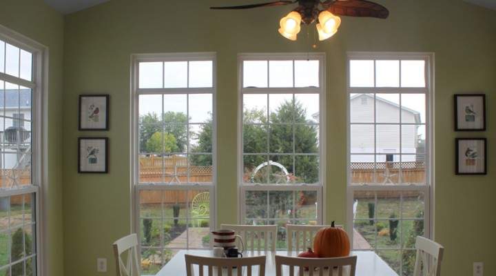
In the adjacent dining area, windows cover an exterior wall, letting sunlight fill the space. Taggart and his team improved this feature by flanking the windows with built-ins and adding a window seat underneath. The bench acts as seating for one side of the dining table and has a lift-up seat for added storage.
“It took so much creative problem-solving to take a tiny space and create so much storage”. – Lanford says.
The most important part of the Lanfords’ renovation, however, was getting a kitchen that felt not only personal, but like something they could continue to grow into for as long as possible.
“It makes us really happy. It makes us look forward to coming home”, – says Lanford, – “It might be a little thing to a lot of people, but it was huge to us. We feel like we’re planting roots and forming tradition, and Burt has a lot to do with that.”


