A bespoke design is the perfect way of creating an ideal kitchen; we look at some of the best models, plus some clever “off-the-shelf” alternatives.
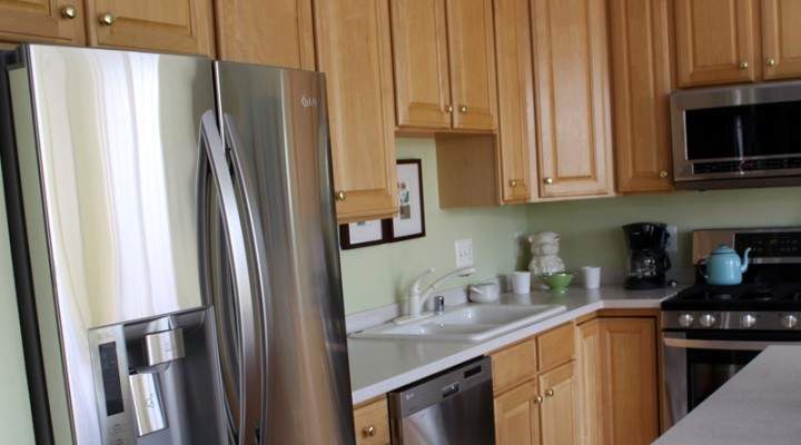
We’ve all daydreamed of a bespoke designer creating our ideal kitchen. While this is a very desirable option, it’s important to remember that, with the help of a creative and knowledgeable team, the skills of a top-notch installer, and a good sense of style, it’s possible to get a high-quality look even if you don’t have a top-end budget. There are times when a bespoke maker is highly desirable – for instance if you have a big room with high ceilings, standard off-the-peg cabinets can look small and out-of-proportion. A large room calls for generously proportioned furniture – taller wall cabinets, a big island unit, and perhaps extra deep or thick worksurfaces. However, don’t forget that bespoke models can also be the right choice for a smaller kitchen, with made-to-order cabinets slotting into awkward spaces and confined corners perfectly. But if your budget doesn’t stretch to bespoke, concentrate on the design process, and analyse every corner, cabinet and space to get the most from off-the-shelf components.
Traditional touches
If your kitchen is lacking in original features, add an overmantel to immediately create a sense of tradition. Most (but not all) heat-storage range cookers will need a flue, so if there is an existing chimney-breast/flue, position it here. If it is is to be a ‘range-style’ cooker, it can still be incorporated into the design with a false wall. Many bespoke designers use the resulting cavity for condiment cupboards within the uprights of the over-mantel.
Island focus
Many kitchens that have been installed in the last few years feature an island unit. It’s the designers’ new favourite, and it really does make the most of a spacious room. However, remember that services may need to be moved into the centre of the room if the island is to include a sink, dishwasher, hob, etc. Modern islands also tend to use a mix of materials – granite for the ‘working area’ and wood for the breakfast bar section is hugely practical. A less costly option is to buy a large, chunky country table to focus attention on the centre of the room – after all, island units are merely an updated version of the cook’s work table.
Perfect planning
Planning the ideal kitchen is an endless task, but one that will prove worthwhile when it is up and running. Although your designer will have the task of doing all the measuring up and squeezing in of key features and components, they can only be guided by what you want. It’s a really good idea to clear out your existing cabinets – be ruthless and discard anything that’s not needed or used. There’s little point in budgeting for new cabinets to hold ‘stuff’ that’s not important to your day-to-day life. If you do have the odd gadget that is used one or twice a year (such as an ice-cream maker or chocolate fountain), pack them up and store them in the utility room or garage, or relegate them to a highlevel cupboard. Internal fittings are vital and the cost can add up, but ergonomic interior storage makes a huge difference. Drawers are more useable than deep cupboards, and don’t forget the plinth or kickspace area, which can be used for pullouts to hold items such as cleaning materials. Work surface space is crucial too – incorporate an island or breakfast bar if you like to spread out while prepping or baking.
Glossy finishes
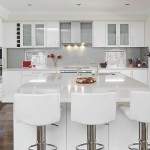
We tend to think of bespoke kitchens as being made from natural timbers or with handpainted finishes – often the attraction is in the specification of natural woods and very precise colour-matched finishes. For those who prefer a matt or glossy lacquered look, there are many ‘off-the-peg’ suppliers who can offer a wide range of colour options, from soft oyster and beige shades to darker and more dramatic looks in dark browns, greys and olives. Avoid a glossy floor if you’re having glossy cabinets – add contrast and texture with natural wood or stone floors, and perhaps combine it with plain matt-finished painted walls.
Bold approach
If you have fallen in love with a modern design, don’t be afraid to mix and match in a period home. The kitchen and bathroom are the most likely rooms in which you can go for the contemporary ‘contrast’ theme, which is hugely successful and, let’s be honest, is totally practical too. As long as there are some ‘classic’ aspects to your kitchen, then a contemporary look can be a breath of fresh air in an otherwise traditional home. Flooring and architectural details are the easiest way of retaining these classic elements – opt for simple wood or stone surfaces, and retain original coving, skirting and windows where possible.
Retro styling
With the plethora of interior design terms being used these days, it can be difficult to keep track of what refers to what, especially if items we grew up with during the 1970s – and which are probably still being used in our parents’ homes – are now termed ‘retro’ or ‘vintage’, rather than just old-fashioned. Seventies interiors were bold, beautiful and fabulously brash – confidently mixing colour combinations with strong geometric shapes and sculpted plastics. These days, with so many different designs and styles to choose from, your kitchen can be furnished in authentic Victorian style from top to bottom, or it can be thoroughly tongue-in-cheek with upcycled Formica cabinets and pineapple ice buckets – or alternatively, a smooth combination of the two. John Lewis of Hungerford has captured the retro mood perfectly with their fabulous Crиme de la Crиme kitchen (left) by teaming it with 1950s diner-style accessories, flooring and door handles.
Lived-in look
There are many additions we can make to our kitchens to help them look at ease within a period home. The most obvious is to go for a distressed or aged finish on the cabinetry. If you’ve inherited a good set of cabinets, consider re-painting them. Some designers suggest giving doors a few carefully placed knocks with a hammer to add to the ‘worn-in’ look, although deliberate intent to create wear and tear takes a certain amount of confidence!
Cosy corners
Period homes are often full of charming nooks and crannies, low ceilings, and uneven walls and floors, making it difficult to buy standard off-the-shelf furniture. Therefore, having a bespoke, handmade kitchen designed for you will ensure a level of fit that cannot be achieved by any other means. Don’t worry, you can still keep the period charm of the property by combining modern-day materials with a retro twist that honours the original style. For instance, vintage-style sanitaryware, such as butler or Belfast sinks, and traditional lighting will help bring the cheerful spirit of the space back to life.
Mixing materials
Any successful kitchen design is a careful blend of different colours and finishes. It’s rare that a designer will stick to one surface or material in a whole room. Of course, a colourful, interesting scheme is often the result of many years of collecting accessories and period pieces – which can all be displayed within the confines of a modern version of a period kitchen, whether it’s crockery, wall signs or antique tiles. However, if you are starting from scratch – perhaps in a newly extended space – and don’t have a stock of decorative collectables, make the kitchen interesting with colourful tiles and a mixture of finishes for the cabinetry, in order to avoid an overly matching look. There’s a big trend for island kitchens to highlight the freestanding unit in a different finish or colour to the surrounding cabinets, and also for different work surfaces to be used to demarcate areas within the kitchen. Introducing items such as woven vegetable drawers also adds variety to the colours and textures within the scheme. As far as walls are concerned, the choice isn’t just between paint and/or paper, a country kitchen can look fabulous with tongue-and-groove panelling – and it can also be used to disguise bumpy walls and less-than-perfect angles.
Open-plan living
The mistress of a Victorian or Edwardian home would be shocked at the thought that virtually every visitor is welcomed into the kitchen, but this room has now become the ‘heart of the home’, and as such, often accommodates sofas, homework stations and media centres. Most technical equipment can be disguised in matching cabinetry, but there is little getting away from the presence of a fl at-screen TV. Once again, an island can come into play, marking a boundary between cooking/eating and relaxing. A table-style island positioned up against the sofa is a good dividing line, while keeping the layout friendly and sociable.
